With summer now suddenly somewhat of a distant memory, we’re getting ready to embrace the cosy season by looking at what the rest of 2023 has in store for us. Going into the colder months can be the perfect time to update your home décor, as you prepare to spend more time indoors with drop-in visits from friends and family! If your home is crying out for a post-summer refresh, keep reading to discover the latest colour schemes forming our final interior trends for 2023.
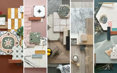
Every year, we tend to long for rich & earthy tones that offer warmth and dependability in the colder months. This year, we’re building upon that desire, looking at colour to induce joy and comfort in our day-to-day lives. We have created 5 autumnal palettes to reflect the rising colour trends this season to see you through the winter and beyond.
Earthy Reds
Reds & pinks have been one to watch throughout 2023, and we’re not through with them yet. For autumn/winter, we’re seeing them evolve into much deeper, richer shades than we’ve seen so far this year, in the form of burnt reds, clay browns, and dusty plaster pinks.

Featured Tiles (top to bottom):
Breton Avorio, Venezia Bianco, Artisan Cotto, Nautilus Bianco, Valentina Blush, Marlow Ivory, Salcombe Ivory Crackle, Soriano Gris, Salcombe Rose Crackle, Hoxton Grey, Celine Gold
Natural stone, terracotta or marble-effect porcelain tiles work beautifully here: anything that supports the earthy, organic influence of the trend. With neutrals, try to avoid bright, stark white which is going to feel very jarring and unbalanced within this colour palette. Instead, look out for materials with pink or yellow undertones that will complement the warmth of these rich reds.
For those wanting to go bolder and braver, consider patterned tiles or play with the mix of contrasting shades – chunky terrazzo tiles on a floor or wall can also add a ‘wow’ factor for a more graphic, on-trend look. When it comes to choosing your furnishings, layer dark woods and natural textiles with warm golds or coppers to build up a luxurious, cosy look.

John Lewis have named Damson their Colour of the Year
Retro Yellows
If dark reds feel too daring, consider going for spiced ochre or honey colours for a pop of softer autumnal colour. Using yellow in interiors is one of the best ways to inject a sense of cheer & energy into your space.
Moving away from the bright, zesty yellows of the summer, we’re leaning towards richer ochres and spiced browns for the winter. The colour is reminiscent of 60s/70s aesthetics, offering a sense of familiarity and reassurance, particularly when used in bold, block-colour formats such as tiled feature walls, soft furnishings or painted kitchen cabinetry.

Featured Tiles (top to bottom):
Horsham Oak, Camden Cotton White, Tiffany Soft Grey, Calacatta Gold, Travertino Light Antique-Effect, Nautilus Bianco, Chiltern Ash, Cavendish Mustard, Bristol Natural
It also pairs well with tonal whites or greys, which can make the trend feel more attainable for those who lean towards neutral styles. Moving into autumn & winter 2023, give the colour a refreshed look by adding natural rattan accessories, jute rugs and dried florals such as pampas grasses for a cosy Scandi style.

Neptune balance a pop of ochre yellow with clean, neutral decor
Jewel Tones
Our next palette draws upon more of the rich, traditional colours of the festive season, making way for royal teals, emerald greens, opulent golds and deep reds.

Featured Tiles (top to bottom):
Onice Twilight Blue, Sicilian Gold, Vintage Racing Green, Valencia Azure, Cavendish Teal, Calacatta Hex Gold, Heritage Bottle Green, Camden Charcoal, Cavendish Mustard
Seen as an antidote to the world of beiges & greys, the jewel tone trend is all about being indulgent with colour. We suggest using metro tiles for large, statement areas of colour here. Or, if that seems slightly daunting, go for something a little sleeker using rich, veined marble-effect tiles for an elegant, captivating look.
When it comes to the finishing touches, gold metallics are a must here, to add a festive hint of glamour and celebration. Textured glass, fluted surfaces and polished materials also add to the sophisticated, refined look that this trend is all about.

Haus Love use bold tiles with gold accessories for an elevated look
Organic Greens
Being within nature is an important part of caring for your wellbeing. Yet, in the darker months, spending time outside can be a struggle thanks to the shorter days and drizzly skies. Green is everywhere; It surrounds us in nature and is a colour we highly connect to emotionally all year round. For the end of 2023, we’re moving away from the zesty lime greens of the summer and seeing the return of the more muted, dusty sage and moss tones. To push the trend further, try pairing an accent of warmth using clay pinks or soft pastels for a fresh, modern take.

Featured Tiles (top to bottom):
Calacatta Emerald, Vintage Racing Green, Shellstone Olive, Valentina Blush, Chiltern Light, Rainforest Porcelain, Deckwood Taupe Ceramic, St Emilion Brushed Limestone, Dijon Limestone, Babylon Olive, Cavendish Moss
When selecting material choices, look at natural-inspired finishes such as stone-effect porcelain tiles or handmade-effect metro tiles, to add areas of interest through texture. For a beautifully down to earth look, bring the outside in by incorporating different shades of green, natural woods and plants within your accessorising, to create your own sheltered sanctuary for the colder months.

Heidi Caillier Design pairs earthy green cabinetry with soft marble and pinks for a warm bathroom look
Grounding Neutrals
Known as the ‘New Neutrals’, warm whites, beiges and stone-based colours have soared in popularity in recent years, taking over from cool greys and brilliant whites as the easy, go-to shades.
Moving into the next season, we’re adding further warmth and taking neutrals to new depths by adding texture, 3D surfaces and natural imperfections. Go for sleek black accessories, muted woods & natural materials to tap into the growing Japandi style: a perfectly balanced blend where calming Scandi palettes meet sleek Japanese design aesthetics.
Neutrals remain as a versatile colour option, making it ideal to be used easily throughout the home. However, this trend comes into new strengths when used in a bathroom to create a luxurious, spa-like space ideal for hiding away from the cold this winter.

Featured Tiles (top to bottom):
Geo Mocha, Chiltern Light, Hoxton Natural, Dijon Limestone, St Emilion Brushed, Milano Bianco, Marlow Ivory, Onyx Reale, Winchester Almond, Cotswold Ivory, Lily Bianco, Veincut Traventino, Wentworth Cross

Abode matt black brassware adds a clean, contemporary edge to the soft neutral palette
Whether you are planning a tiling project for the new year or looking to refresh a space in time for the holidays, keep ahead of the trends by discovering our new in tile ranges, and order your free samples today. To give your current tiles a spruce up, you can also find our tile maintenance guides on our help & advice page, where we share tips on how to clean and care for your tiles over winter.


